On Monday last week, my former best friend of over a decade broke up with me.
So naturally, I did the most tech bro thing imaginable and turned our message history into a deployed data story.
I won’t belabor the emotional experience of creating and then demo’ing this (twice), since this is meant to be more of a technical blog post. And I plan to write a real essay about it for my March post on Substack. So I’ll just rephrase a tweet I wrote before getting to the meat and potatoes.
Last week, I was already crashing out over the future of work/an existential identity crisis. This project helped me feel curious again, and pulled me back into calm competence. Data analysis and visualization is in my wheelhouse; writing weird essays is in my wheelhouse. I hadn’t combined them before, so this was my chance. Data analysis especially was never a zero-to-one experience. I was usually working with structured data (SQL) and using existing visualization tools and frameworks (PowerBI, R ~8 years ago which was amazing).
When I look at the finished work, there’s a sense of peace and appreciation for what I think is a beautiful artifact. There’s no vulnerability hangover for me; maybe I got enough practice over the last year opining my bizarre takes, or maybe it’s because I don’t think about other people when I share things. If someone sees this and can relate to it, that’s a bonus.
The personal is how you get to the universal.
Reflection
I didn’t set out to make a data story, which apparently is called scrollytelling. It’s a design choice popularized by the New York Times; D3.js, the Javascript library that drives custom visualizations, was created by former NYT graphics editor Mike Bostock.
In fact, I didn’t set out to make any data visualizations. You have to look at the data first before you think about visualizations; I wasn’t sure there’d be a story in the data worth visualizing. And I didn’t think I’d go public with a Saturday demo until Thursday night. At Fractal Tech, our week five assignment was to scope down and polish a great product or tool to completion, ideally with user feedback. I was working on a Substack tool, which was enraging to research (details in the logs below if you want my anti-Substack rants). We’re allowed to demo anything related to our experience though, so I was thinking of sharing something about managing crash-outs. But lo and behold, this data story emerged organically.
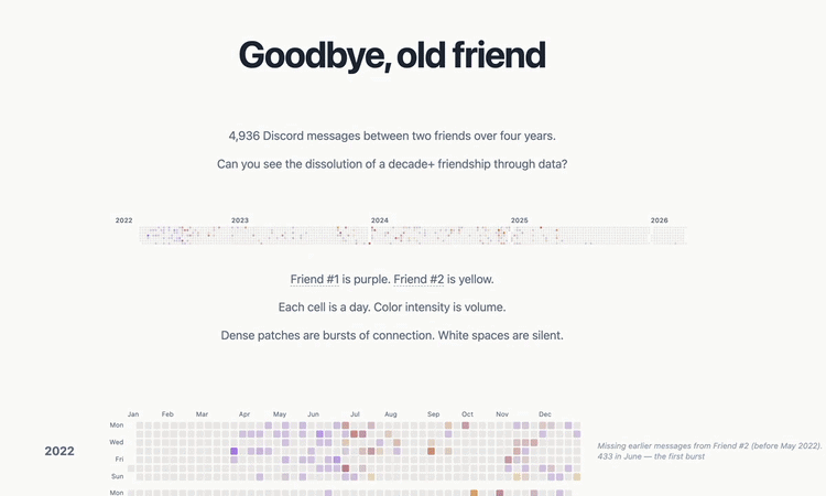
What I started with was an extraction of messages. I have a penchant towards data hoarding, so when anything ends, whether an online course or relationship, I’m saving that shit. So Monday went: got the last text, sent one last text back, exported data and media. 4,936 messages from 2022 to 2026. We had messages going back to probably 2016/17, but my former friend had lost access to accounts and ran a script to wipe out all historical messages, so I was left with only 2022+.
After other failed experiments, I returned to the data on Wednesday. What was in the data? Did the data match my memory? Were the signs of death always lurking there, unknown to us?
I was sure there’d be surprises, yet I was still surprised.
To start, I returned to what I was already familiar with: Jupyter notebooks. I’d learned to use them in my Masters program, hardly used them for a decade, then super-used them with the help of Claude two weeks ago for the fine-tuning project. Claude and I iterated through 6 notebooks: parsing and cleaning raw data, summary statistics and core metric exploration, clustering with HDBSCAN, classification of HDBSCAN clusters with Claude Haiku, classifying messages as turning toward / away / against bids for connection with Claude Haiku, and finally scoring conversations for the Gottman Four Horsemen (contempt, criticism, defensiveness, stonewalling).
My hypotheses went something like this: we’d be pretty evenly matched on volume of messages, expressiveness (emoji reactions), with a slight imbalance of message initiations from me (no higher than 60/40). I thought our topics of conversations probably narrowed over the years, but there wouldn’t be any problematic Gottman findings (turning away from bids, contempt etc) until the very end. Not that there weren’t any Gottman red flags in our friendship; if I had all the data from 2016+, I’m pretty sure Claude Haiku would’ve picked up on issues. But the time period after 2022 was relatively free of conflict. I thought most likely our friendship ended because we drifted apart, and that the final fight was the last straw.
Aside from the Gottman hypothesis and the narrowing of topics, every other hypothesis was wrong. We had extreme imbalances across several metrics from the very start of the dataset, and our friendship didn’t end due to drift. At least, not from the technical definition of drift. Drifting apart implies a sort of emotional neutrality, but our friendship was never neutral. It was an intense playground from start to finish. No matter how dark the topic, we could find humor in it. The problem was that the warm play bled out, leaving only the cold, venting negativity. This finding never would have happened without a conversation I had with a bootcamp friend, John. He suggested I look into “emotional valence”, an unfamiliar term. I explored it with Claude, and we made a 7th notebook for valence.
The 8th and last notebook didn’t flip any conclusions, but it changed the way I perceived the river diagram. The river (a streamgraph) represents the breadth and volume of topics we discussed. With HBDSCAN clustering, about 80% of our ~5K messages were thrown out because they were seen as noise/couldn’t be categorized into a topic. Makes sense, because casual DMs like “lol” embeds as nothing useful. But I was worried that there was real signal in the missing 80%, so further discussion with Claude lead to TextTiling. Unlike HBDSCAN, which treats each message as a separate entity and throws out any timing/order, TextTiling treats messages sequentially, the way conversations naturally flow. Even short “lols” inherit context from neighboring messages within a sliding window. So the last notebook was TextTiling, because I wanted 100% coverage.
Turns out both algorithms drew the same river shape. Compare the TextTiling version I deployed to the HBDSCAN 4th prototype - practically identical. I kept TextTiling because the width of the river is more accurate to actual volume, but the key insight here is that bottom-up (HBDSCAN) and top-down (TextTiling) algorithms reached the same shape. This convergence means that our friendship really did narrow.
Once I reviewed the Jupyter notebook outputs, I started spinning up data visualizations. The only one I knew for sure I wanted was the Github activity/heatmap. For the rest, I asked Claude to help me draw out a bunch of different prototypes with separate HTML pages we co-named labs:
I worked with Claude on what charts to cut, combine, redo, restyle etc. Sometimes Claude’s original chart was better than what I envisioned. Sometimes Claude would forget to keep a cohesive style across the data story. The best refactor I thought of was to separate the essayistic parts from the charts, so that all the sentences could be revised in a markdown file, saving me from hunting down various JSX elements. This refactor also lead to the on-hover idea; in essay writing, I have a tendency towards footnotes because I like asides too much. In this case, Claude made some nice charts that I didn’t want to waste. So I had Claude enable {{ }} syntax in the markdown file so that we could insert full charts as on-hover footnotes.
I’ll end with the on-hover trick as a metaphor for the finale: what was hidden in plain sight? In other words, what could the data NOT see?
Well, the data couldn’t see what we withheld from each other. No data pipeline can encode what never existed; only I can fill in the gaps, and even then, only from my side. Our river of topics had narrowed-but the data can’t tell you why. Only I knew what I didn’t say.
Or maybe I could’ve asked Palantir. They probably knew my friendship was going to die years before it really did.
Learning about Learning
- Week 5 = 38 conversations. ~$151 in Claude API costs
- To solve an existential crisis crash-out, simply channel a different sort of loss into a beautiful artifact
- I think I understand my project selection filter more: “does the question pull me in?” is necessary but insufficient; I also need “does the work between the question and the answer stay interesting?” (last week’s fine-tuning lost momentum due to the manual, repetitive work of making training data pairs)
- Feedback from peers is key; a bootcamp friend suggested emotional valence, which shifted the entire underlying thesis
Key Concepts
- Data pipeline as architecture: Discord JSON → parse → metrics → Parquet → JSON → D3.js
- An (interesting, imo) application of psychological/relationship frameworks (Gottman Institute) and hypothesis testing (“Does the data match my memory?”)
- Two-layered classification: first = topic of discussion, second = valence (how it felt to talk about those topics)
- HDBSCAN vs TextTiling: two different algorithms drew the same river shape, which means they likely converged on real meaning in the data
- Design as argument: what to keep in terms of data visualization, what to throw away - the final chart was in grayscale because the data can’t measure what’s not there
- Static site as a design decision: No API/fetch/runtime data loading. JSON files are bundled at build time. Final artifact is a frozen snapshot, closer to an essay than a web app.
Random
- Making the gif took nearly 2 hours from screen recording -> QuickTime -> redo in iMovie -> ezgif…I have no video editing skillz
- iMovie freeze frame and speed adjustments are pretty good, though I wished I had an OP AI video editor that I could just talk to instead of Cmb+B everywhere
Tech Stack
- Terminal: Still inside VS Code :)
- IDE: Visual Studio Code
- Github: Discord Dashboard repo - private, sorry!
- AI: Claude Code Opus 4.6
- Languages: Python, TypeScript
- Frontend: React 19, Vite 7, TypeScript 5.9
- Data Visualization: D3.js v7 — custom-built charts (streamgraphs, heatmaps, latency EKGs, bar charts, line charts, annotation timelines). No charting libraries.
- NLP & Sentiment: sentence-transformers (semantic embeddings for TextTiling topic segmentation), VADER (valence/sentiment analysis), OpenAI Whisper (voice message transcription)
- Data Processing: pandas, NumPy, custom Python pipeline (parse → metrics → export)
- Data Formats: Discord JSON exports → Parquet (intermediate) → JSON (dashboard consumption)
- Exploratory Analysis: Jupyter notebooks (8 notebooks: exploration → activity → embeddings → topics → bids → Gottman → TextTiling → valence), Plotly (notebook visualizations)
- Backend: None (static site, all data pre-computed)
- Database: None (static JSON pipeline)
- Testing: Manual notebook-based validation, checking outputs on localhost
- Dev Tooling: ESLint, typescript-eslint, setuptools (Python packaging)
- Live Deployment: Vercel
- System Diagrams: Pen and paper
Daily Logs
My daily posts on Substack/Twitter and the daily summaries below are fully written by me. For the bulleted PR logs, I let Claude Code read my git commit history and write the summaries, with me as the editor.
We had one system design lecture this week on web crawling, which was excellent. I loved the topic and I enjoy system design lectures. Lecture was Wednesday the 4th, then we had two recitations on it Thurs and Sat. I called the diagram a spider-looking thing
Day 28 - Sunday
I wrote and published What AI is really doing to work on Substack.
The future of work was causing me to crash out last week, a crisis that erupted in the first half of this week…a self-induced problem!
Day 29 - Monday
Skipped daily post ;(
No PRs; too busy crashing out about work identity. My former friend texted me to end our relationship formally, which didn’t help the crash out. I exported oue raw Discord message history with a nice CLI tool, so I toyed around with the idea of rebuilding it, but Discord Chat Exporter was pretty perfect already. So then I considered making a Substack tool, but exploring Substack’s API for Developers page made me ragequit. They have a single GET endpoint for looking up a LinkedIn profile on Substack…bro, if this is your API support, just put a “fuck you” page instead ok? Save us both the trouble.
I could barely tolerate Substack to begin with, and now I really can’t stand it.
Nonetheless, I’ll probably still build a Substack Export Tool because yes, I want to export my stuff off their ridiculous platform.
Day 30 - Tuesday
Skipped daily post ;(
Still crashing out. I checked in with my Claudebook re: my learning patterns and tested out a “voice DNA” Claude skill for capturing writing voice patterns. The guy who made the skill proclaimed: “i got claude to actually sound like me, and it’s kinda ruining my ability to tell which drafts i wrote myself lol” - total bullshit. Either a pure marketing gimmick, or his writing really is that terrible.
Wrote most of my week four blog post.
Day 31 - Wednesday
Skipped daily post ;(
Decided to go full tech bro and turn my dead friendship into a data science project. Went through a full compound engineering loop: brainstorming, planning, work, code review. Thanks Claude skills!
- 3 commits on main — Scaffolded the repo, added brainstorm and PRD docs, added initial Python scripts (parser + metrics)
- PR #1
plan— Addressed all P1 code review findings: privacy fixes, parquet list handling, clustering corrections, row count validation
Day 32 - Thursday
Daily Posts: Substack | Twitter
Crashout half-exited. Went from Jupyter notebooks to a working NYT-style scrollytelling dashboard with 6 D3.js visualizations. I did ask Claude briefly whether analyzing a friendship through data is even a healthy thing to do, but decided to continue down my sociopathic path.
- PR #2
review— Compound engineering review of notebooks and pipeline code - PR #3
work— Massive cleanup: vectorized response_latency from O(n²) to O(n), extracted dead_air_gaps(), fixed timezone handling, hardened Claude API parsing with caching, replaced sys.path hack with pip install -e ., saved row-level metrics for dashboard drill-down - PR #4
plan2— Added extract_bid_pairs and create_conversation_chunks to metrics module, built notebooks 05-bids and 06-gottman for relationship dynamics analysis - PR #5
nb5-6— Fixed bids notebook (idempotent merge, retry failed pairs, filter noisy months), re-scored Gottman horsemen as interpersonal-only, deduplicated bid pairs in metrics - PR #6
dashboard— The big one: brainstorm and implementation plan docs, reorganized data into pipeline/cache/metrics/raw, built parquet-to-JSON export script, created the React + D3 scrollytelling data story with 6 initial visualizations
Day 33 - Friday
Skipped daily post ;(
Story building and feedback time. Iterated on charts, wrote narrative content. Feedback from two peers made their way into the dashboard - shoutout to John for the emotional valence idea and Josh for removing the left-to-right Github scrolling.
Went out to Jongro Korean BBQ with a group of six, including a friend visiting from SF. Came back to Fractal and worked until 2am.
- PR #7
datastory— Replaced bid/Gottman charts with shadow profile story arc, added asymmetry toggle (initiation vs presence vs volume), contribution ratios with hover tooltips, voice message latency chart, text latency prototypes, river graph with zero-baseline stacked area styling, fixed EKG time domain axis - PR #8
plan3— Added README (oops finally), brainstorm docs for 4 planned features (TextTiling, content refactor, valence scoring, scrollytelling), Claude-reviewed all plans - PR #9
refactor/markdown-content— Extracted all narrative content from App.tsx into a markdown file with a Python parser, built a Vite plugin for content.md hot reload, unified annotation data shape across all charts - PR #10
feat/texttiling— Implemented TextTiling topic segmentation with sentence-transformers embeddings achieving 100% message coverage, addressed code review findings (2 P1, 5 P2), added architecture and product docs
Day 34 - Saturday - Demo Day
Daily Posts: Substack | Twitter
Ship and demo day! Switched from HBDscan to TextTiling for the final river charts, polished every chart, and deployed on Vercel.
3 min presentation again, very strict timing. We finished all demos within an hour.
- PR #11
feat/valence— Built emotional valence scoring pipeline for conversation segments using VADER sentiment analysis - PR #12
scrolltell— Prototype page combining TextTiling topic segmentation with emotional valence charts - PR #13
demo— Final polish: swapped all charts from HBDscan to TextTiling view, added SVG emotional valence on hover, built a general on-hover asides system for markdown content, renamed “User A/B” to “Friend #1/Friend #2”, stripped HTML comments from prose parser, finalized the shadow profile chart - 4 commits on main — Deployed to Vercel: committed JSON data files for build, resolved TypeScript errors, added vercel.json config
Day 35 - Sunday - Bonus Demo Day
Skipped daily post ;(
I was tempted to write a hot take about how real breakups are far worse than friend breakups, since the opposite has become a bit of a meme in recent cultural memory. But instead I spent the day at Fractal Tech (on my day off!) meeting new people and doing a round two of the demo at Sidequest.
Round two went way better, partially because I got 4 minutes instead of 3, partially because I got good sleep, partially because spring is here at last…plus, I was just way more in my element. I had practiced once already, so I spoke much more fluidly. Cracked a lot more jokes off-the-cuff. I had made a silent New Year’s Resolution to stop making self-deprecating jokes, but man, I just can’t do this fucking “I’m the best” American poptimism. Spiritually I am British, which is a cucked thing to say as a Chinese person.
Anyways, I’m really glad I demo’d again because it helped me connect with tons of people in the crowd afterward. Daresay I’ve met some potential new friends to replace all the ones I’ve lost. :)
Usually I’d put Sunday into the next week’s blog post, but this one was a natural continuation.
Future Considerations
Braindump for what I can improve, other ideas etc
Near Term
- Add signature - a “Made by lowyelling” somewhere
- Make the on-hover sparkline charts much larger! They’re tiny right now
- Update verbiage; some of the sections (especially on hover) could use a second pass
Long Term
- Could this be a real product (or open source tool?) I don’t want to be in charge of anyone’s private/personal data, nor do I want to keep paying for an API key
- But if I were to productize this in some day, it’d have to be two separate products: 1) Python analysis layer and 2) Data visualization layer
- Python part would be relatively easier (extract Jupyter notebook functions)
- Data viz is hard because every relationship story is different
- Maybe this is the one I host on Raspberry Pi :)
- Make it mobile friendly